
TOP 5 Interior Photography Composition: The Secret Every Interior Designer & Photographer Needs
As an interior designer or photographer, capturing the perfect shot isn’t just about having the right tools—it’s about mastering composition. Whether you’re photographing a luxurious living room, an elegant kitchen, or a sleek modern building, composition is what makes your images stand out and resonate with your audience.
But let’s be honest: when it comes to creating images that wow, it can be tough to know where to start. Are your photos engaging enough? Are you losing the viewer’s attention with chaotic compositions? How do you ensure that your designs look just as beautiful in your photos as they do in person?
These are questions every interior photographer and designer faces. But here’s the good news: composition doesn’t have to be complicated. There are simple yet effective techniques that can take your work to the next level—and we’ve put them all together in a quick-reference Composition Cheat Sheet designed for exactly these moments.

1. Rule of Thirds: Achieving Balanced and Engaging Photos
The Rule of Thirds is one of the most fundamental composition techniques. By dividing your frame into three equal parts both horizontally and vertically, you can position key elements of your scene along these lines or intersections. This creates a natural balance, making your photos more dynamic and visually appealing.
Tip: Try placing architectural details, furniture, or key design elements along these lines to avoid a static, centered composition. It will give your image a sense of movement and flow.
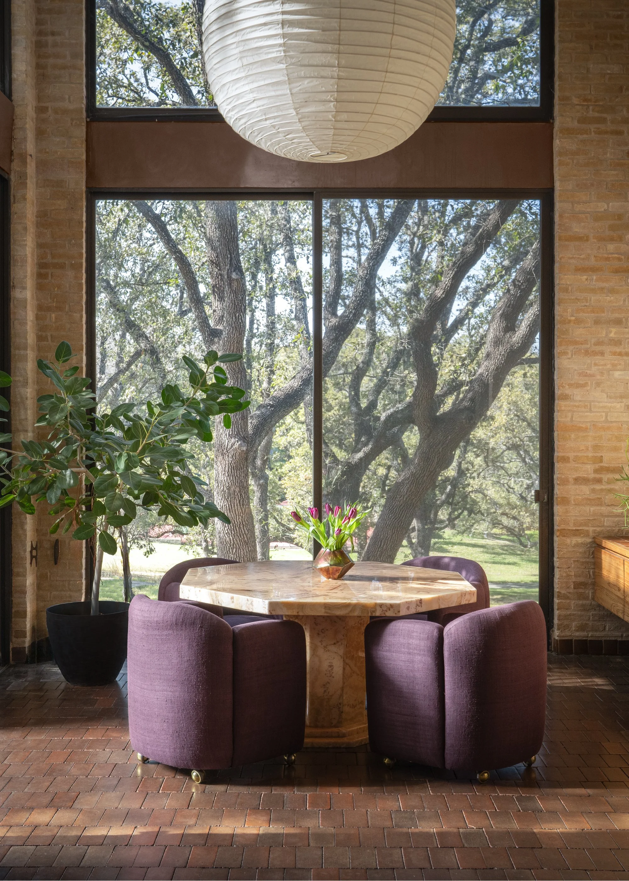
Photo: Studio Eckström reimagines the Gilded Age salon for a self-made modern gentleman—our fictional muse, Mr. Trotter—where heritage meets reinvention. Faience tile, Palladian symmetry, and crystal light mingle with American resolve and quiet confidence. Every surface tells a story: of craft, of character, of becoming.

2. Leading Lines: Guide the Viewer’s Eye Through the Frame
In interior photography, Leading Lines are an effective way to create depth and focus. By using natural or architectural lines (like hallways, windows, or furniture arrangements), you can draw the viewer’s eye toward your focal point, creating a sense of direction and flow in the image.
As a designer, you want to ensure that your work is the focal point of every image. With techniques like Leading Lines and Symmetry, you can guide the viewer’s eye toward key elements in your design, ensuring nothing is overlooked.
Tip: Use doorways, stairs, or tables to guide the viewer’s eye toward a statement piece, like a centerpiece or architectural detail.
Photo: Canales & Co Interiors- Liberty Ranch: From the beautiful quartzite countertops in the kitchen to the charming leather and wooden knobs in the playroom, every thoughtful detail turned this space into home for great clients.
3. Symmetry: Create Balance and Harmony
Symmetry works wonders in interior photography, especially when shooting spaces like living rooms, kitchens, or entryways. The clean, structured look of symmetry provides a professional, polished feel to your images.
Tip: Center key features, like furniture or lighting, to emphasize the balance. This technique works best with architectural spaces or minimalist designs. Symmetry also helps create harmony in the image, making the space feel cohesive and well-organized.
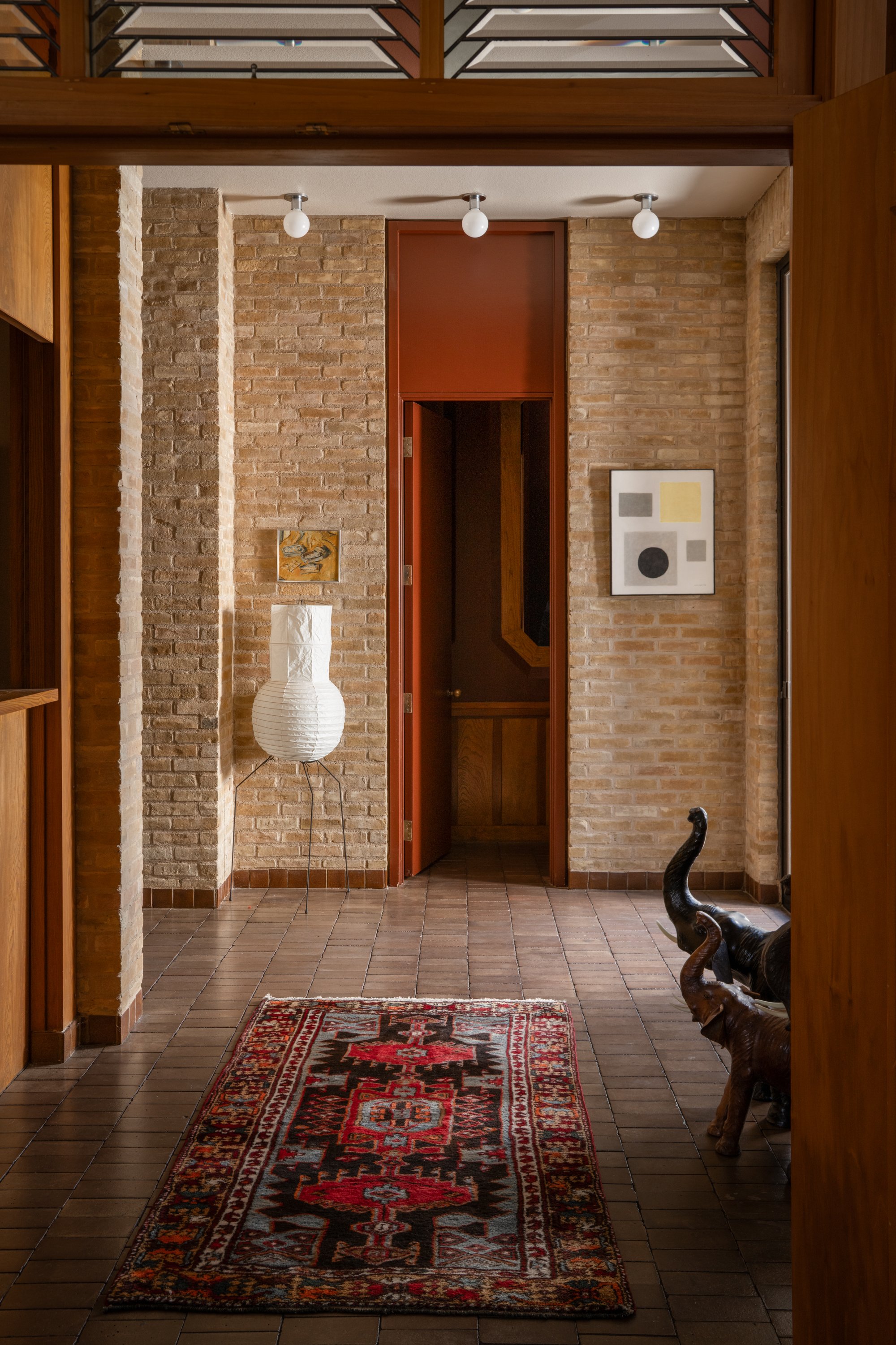
Photo: Joel Mozersky Design - Joel Mozersky’s home in San Antonio — featured in Vogue Living.
4. Framing: Add Depth and Focus to Your Subject
Framing is a great way to focus attention on your subject by surrounding it with elements within the environment, such as windows, doorways, or arches. This adds context and depth, drawing the viewer’s attention to the focal point while also showcasing the surrounding details.
Tip: Look for natural elements in the space to use as a frame, like doorways or large windows, to isolate your subject and create a more intimate feel. Framing will help ensure that your designs appear as balanced in photos as they do in person.
Photo: Joel Mozersky Design - Joel Mozersky’s home in San Antonio — featured in Vogue Living.
5. Diagonal Lines: Adding Energy and Movement
Diagonal Lines are perfect for creating a sense of energy and movement within your interior shots. These lines can add depth, guiding the viewer's eye across the frame and giving the image a dynamic, three-dimensional feel.
For designers, this technique can be especially valuable for showcasing dynamic elements in a space, like a dramatic staircase or angled furniture. It helps highlight the architecture and adds a layer of visual excitement to your photographs.
Tip: Use elements like furniture, rugs, or architectural lines to create strong diagonal lines that lead the eye through the frame.
Why Composition is Key to Success
For photographers, composition is the difference between a snapshot and a showstopper. You might have the most stunning room or the most beautifully lit subject, but without proper composition, your photo can fall flat. Think about it—without knowing where to place key elements or how to balance a shot, even the best lighting and styling can lose its impact.
Interior designers also face similar challenges when their spaces are photographed. A room that looks perfect in person can feel off in photos without careful attention to how the elements are arranged, framed, and lit. A beautifully designed space deserves to be showcased in the best way possible—without distractions or imbalanced visuals.
Want to Master These Techniques?
The Composition Cheat Sheet is designed to guide you through the process of creating visually compelling and professional compositions—whether you're an interior designer seeking to have your spaces photographed or a photographer wanting to make your images more dynamic.
Here’s how it can solve your biggest pain points:
Make Your Photos Stand Out: With composition tips like the Rule of Thirds, Z-Pattern, and Framing, you’ll know exactly where to place your subjects and how to use the environment around them to tell a story. No more awkward, unbalanced shots.
Draw the Eye to What Matters: As a designer, you want to ensure that your work is the focal point of every image. With techniques like Leading Lines and Symmetry, you can guide the viewer’s eye toward key elements in your design, ensuring nothing is overlooked.
Create Harmony in Every Frame: Achieving balance is one of the biggest challenges, but with tools like Symmetry and Patterns, you can create images that feel cohesive and aesthetically pleasing, making your designs look their best.
Boost Your Client Portfolio: Having a strong understanding of composition will allow you to photograph interiors and exteriors in ways that grab the attention of publications, editors, and future clients.
Save Time and Effort: Instead of second-guessing your shots or trying to figure out the "best angle" on the fly, you’ll have a tried-and-true guide at your fingertips. This cheat sheet will save you time and frustration, giving you more confidence when you shoot.
Ready to Take Your Compositions to the Next Level?
If you’re ready to elevate your photography skills or make sure your next design shoot is flawless, the Composition Cheat Sheet is the perfect tool to help you. With easy-to-follow rules, practical tips, and visual examples, it’ll become your go-to resource every time you pick up the camera.
Download Your Free Cheat Sheet Now! jeffjonesphoto.com/composition-cheat-sheet